Driving Conversion
Designed whilst I worked with Home Shopping Europe GmbH
Home Shopping Europe kicked off 2021 with a corporate redesign. Along with it came a new strategic plan to revitalise its old telemarketing image and distinguish its worth to a younger market. We had 2 goals:
entertain and inspire our users to become customers through entertaining content.
increase the add-to-cart rate and hit our revenue goals for each quarter.
Empathise
When approaching any design problem, my first task is to gain an understanding of the people I’m designing for and the problem I’m trying to solve.
Using Hotjar, Google Analytics and Usertesting.com I gathered data and insights to build a story around the customers’ current experience when visiting the webstore. I analysed personas and compared them with business goals to spot opportunities, and I made market research to understand the problems facing the wider industry.
Important data
5m 45 seconds is the average session duration
54.03% of visits come from mobile devices
28% of usability errors come from mobile devices
User Journey Map
Model representing the highs and lows I found in a basic UX audit from the point of view of “Sceptical Sarah” (one of our 6 user personas)
Define
The webshop was designed to achieve 375 mil. euro revenue by the end of the second quarter. We observed that the product wasn’t meeting our goals, so as a team defined the problems we wish to address.
From past research, I knew there was a direct correlation between entertainment and the views on our product detail pages(PDP). Furthermore, I discovered over half of our audience browsed and converted to customers using a mobile device(54%) yet the majority of errors were also coming from mobile devices(28%).
Problem summary
low entertainment was causing an 80% traffic drop-off on our PDP’s
many new customers didn’t trust the webshop due to its poor technical performance, they were worried it was a “fake store”
clunky UX was making it difficult for customers to do what they want
Mini audit
To create a hypothesis, I collaborated with product managers and customer intelligence. After compiling all the evidence we created an opportunity solution tree.
Hypothesis
We believe that by optimising the mobile experience and prioritising the entertaining content for our new target market(40+), we will reduce the traffic drop-off by 20%.
I choose to split the problem in two
-
1. optimise the mobile experience
-
2. make browsing for a product fun
Ideate
Whilst ideating I regularly communicate with the relevant product manager and engineers who will most likely work on implementing the solution. This aligns expectations and prevents any “nasty” surprises later down the line.
Risks
optimising the UX on mobile would not be so straightforward due to dependencies on desktop as the initial designs were not mobile first
there was a risk that customers would not trust the 3rd party solution for AR as they may interpret it as clickbait for fraud
Optimise the mobile experience
This solution would improve how users pick their desired colour and size of clothing before adding it to the basket. It was a simple action we saw most users struggle with in usability testing.
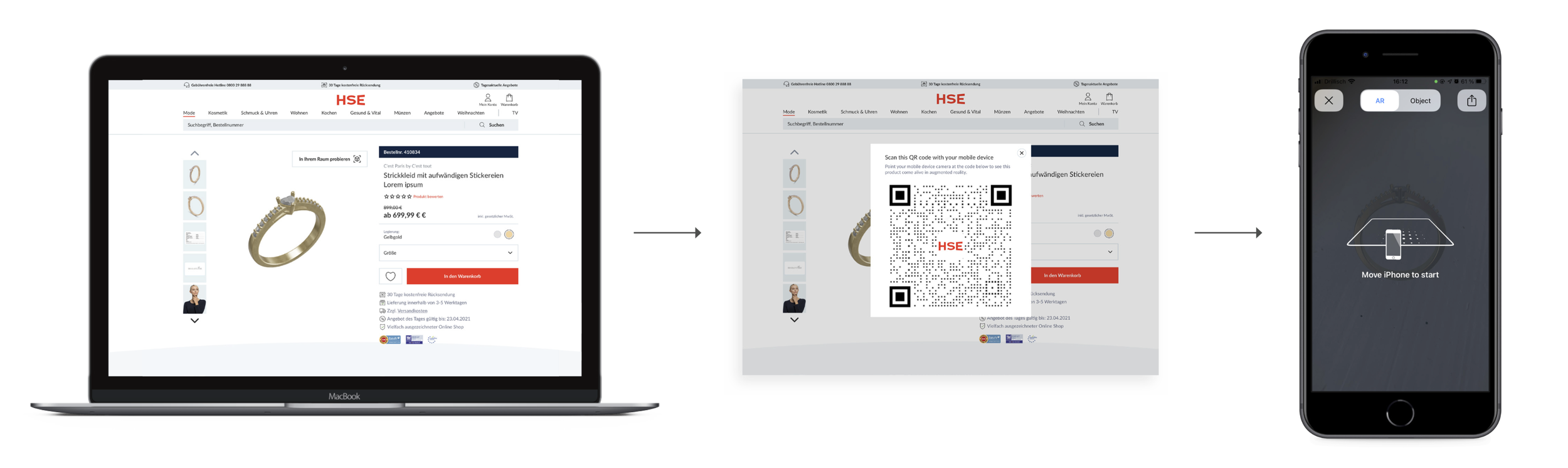
Make browsing for a product fun
By integrating an AR feature on a product’s detail page we would transform the viewing experience into something more tangible and entertaining.
Digitising my scribbles

Design
Articulating a solution clearly and efficiently can be a major pain point in handoff to development. Since sometimes I use prototypes to test on users, it is also important they behave as expected to retrieve accurate results.
In this case, I created screens in Sketch and made the experience more realistic in InVision. I support solutions with documentation describing interactions and scenarios.
What I learned.
clear and well-edited UX documentation can distinguish between a smooth or complicated handover to engineers
pairing can speed up the implementation process as designer and engineer can live troubleshoot unexpected issues
Prototype
Optimising the mobile experience by improving the product variant pickers
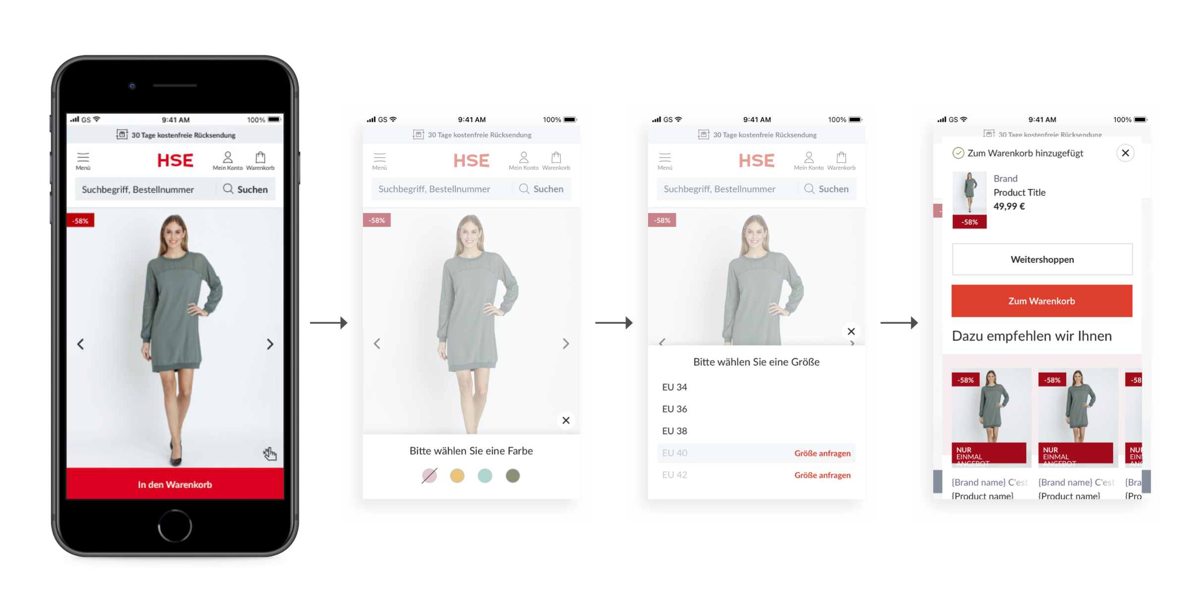
Prototype
Make browsing for a product fun through AR
Test
Testing is important for continuous improvements and for defining whether our solutions are successful or not. For the mobile optimisation solution, I was looking for improvements in usability and a reduction in user errors adding their desired product to the basket. For the AR feature initially, we were looking for user adoption and later we compared it with add to basket rate.
For usability tests, I used usertesting.com to gather insights and verify that my solution has been an improvement. I also analysed Hotjar Feedback and with help from the data team, I was able to monitor errors on mobile. For both solutions, we implemented an A/B test (but not at the same time or the same products) with controls to compare whether improvements had been made.
Learning highlights
testing revealed unknown assumptions such as chatbots and marketing pop-ups that impacted the experience of the new solution
moving between desktop to mobile for AR for many users wasn’t a convenient experience,
we were not able to track users that converted from desktop to mobile for the AR feature
Results
Optimising the mobile experience by improving the product variant pickers
80% task success rate
30% reduction in useability errors when adding an item to the basket using this method
However, in A/B testing customer frustration has increased (especially when using smaller devices). Chatbots and feedback buttons reduce already valuable space and the introduction of a sticky button has caused more confusion to users trying to complete tasks.
Make browsing for a product fun through AR
3% increase in add to cart
12,870 Clicks on AR Button
4% returns rate decrease
However, user testing revealed some areas for optimisation. User’s complained about the process being clunky and requiring many clicks.
Final words
What went well.
Analysing and defining the problem areas we wish to tackle was fairly straightforward. A major highlight for me was learning how to use an Opportunity Solution Tree which the product manager and I referred to frequently during the discovery phase.
What blockers I faced.
The customer base of HSE is much older and notoriously suspicious of the internet and shopping online. Over the years HSE built trust with customers and it was important they did not think the AR feature was a clickbait scam. Although the 3rd party integration was marketed as a white-label product, it soon became clear we would need to negotiate with the provider to give us more flexibility so the look and feel was clearly “HSE”.
How I dealt with problems.
During the implementation phase engineers discovered a strange behaviour in the experience. We arranged an impromptu pairing session and were quickly able to solve the issue. Afterwards, I amended the designs to reflect these changes.
What I would have done differently.
I did not initially consider all the marketing pop-ups and chatbots which disrupt the user experience when I was designing my solution. In the future, I would communicate clearer with other departments to discover their plans for upcoming campaigns or perhaps find a solution which can accommodate us all, such as; disabling pop-ups for certain pages.
Home Shopping Europe GmbH
Home Shopping Europe(HSE) is a teleshopping and e-commerce company. Their three TV channels (HSE, HSE Extra and HSE Trend), reach about 46 million households across Germany, Austria and Switzerland.