Virtual Trainer Assistant
Designed whilst I worked at milon Industries GmbH
Like sports itself, the health and fitness industry is highly competitive. To stay on top of the market milon decided it was time to release a brand new version of their original trainer assistant, the “milonizer”. It would include a new hardware design and for the first time ever, it would be built with the game engine Unity.
Empathise
We did not have a huge budget for user research. However, I knew the value of data so I made it my priority to find out as much as I could through various means.
I collaborated closely with several department experts at milon: marketing, business development, business intelligence, product owners, product management and the Head of Fitness.
I did onsite interviews, surveys, task observation, dogfooding, data analysis and user empathy mapping. I travelled to conferences across Germany to meet with potential customers and interview them to understand their needs. As well as evaluating the competition on the market against our current trainer assistant tool.
What I learned.
We have two different markets using our products; gyms vs. healthcare providers
Seasonal offers and the weather correlate with peaks and troughs in engagement
Many physiotherapists and coaches report the majority of features are of little value to their work
Define
Defining our user needs was an important step in the double diamond approach we used in the milon product development team. The insights I gathered in the empathise stage could now help define the initial challenge in a different way. Because I was the lead designer I also had to plan and estimate UX sprints along with the frontend developer.
I set up a series of playback presentations and pairing sessions with the product manager and lead engineer so we as a team could define the areas we wish to tackle first. We had weekly check-ins with stakeholders to manage expectations and update them on our findings.
Facing a difficult reality
The current technology is outdated and the screen is too small
Many of the features had less than a 6% adoption rate
Less than 20% of existing customers were satisfied with the product
Hypothesis
We believe by modernising the old trainer assistant tool and releasing it as a new product, we will help users quickly onboard customers, and it will become an essential part of any training centre.
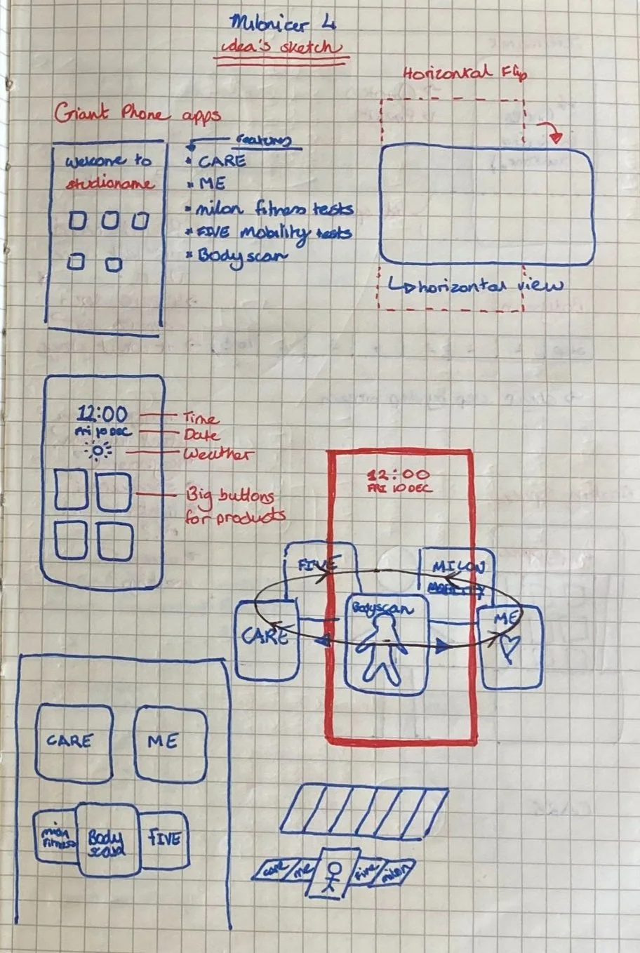
Ideate
I wanted to propose as many ideas as possible to solve the problem at hand, whilst saving judgment for now. Furthermore, I began mapping assumptions based on my scribbles and early interactions with the hardware prototypes.
Sticking to pen, paper and occasionally the whiteboard, I began applying everything I learned in the empathise and design stages to propose unrefined solutions. I requested input across the business to verify the requirements and communicate potential problems as early as possible.
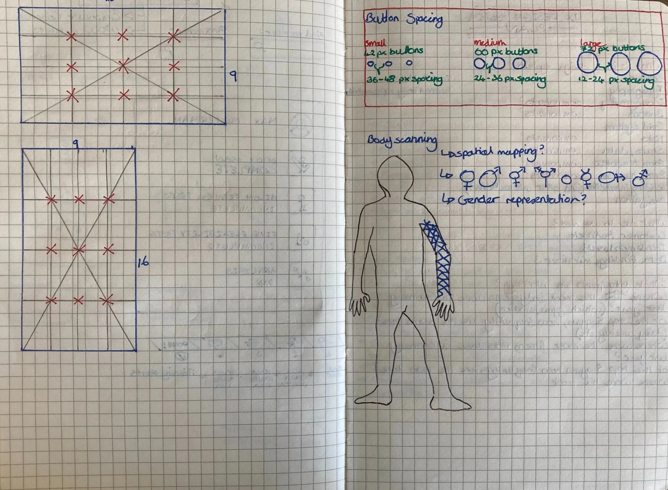
Mindful of constraints
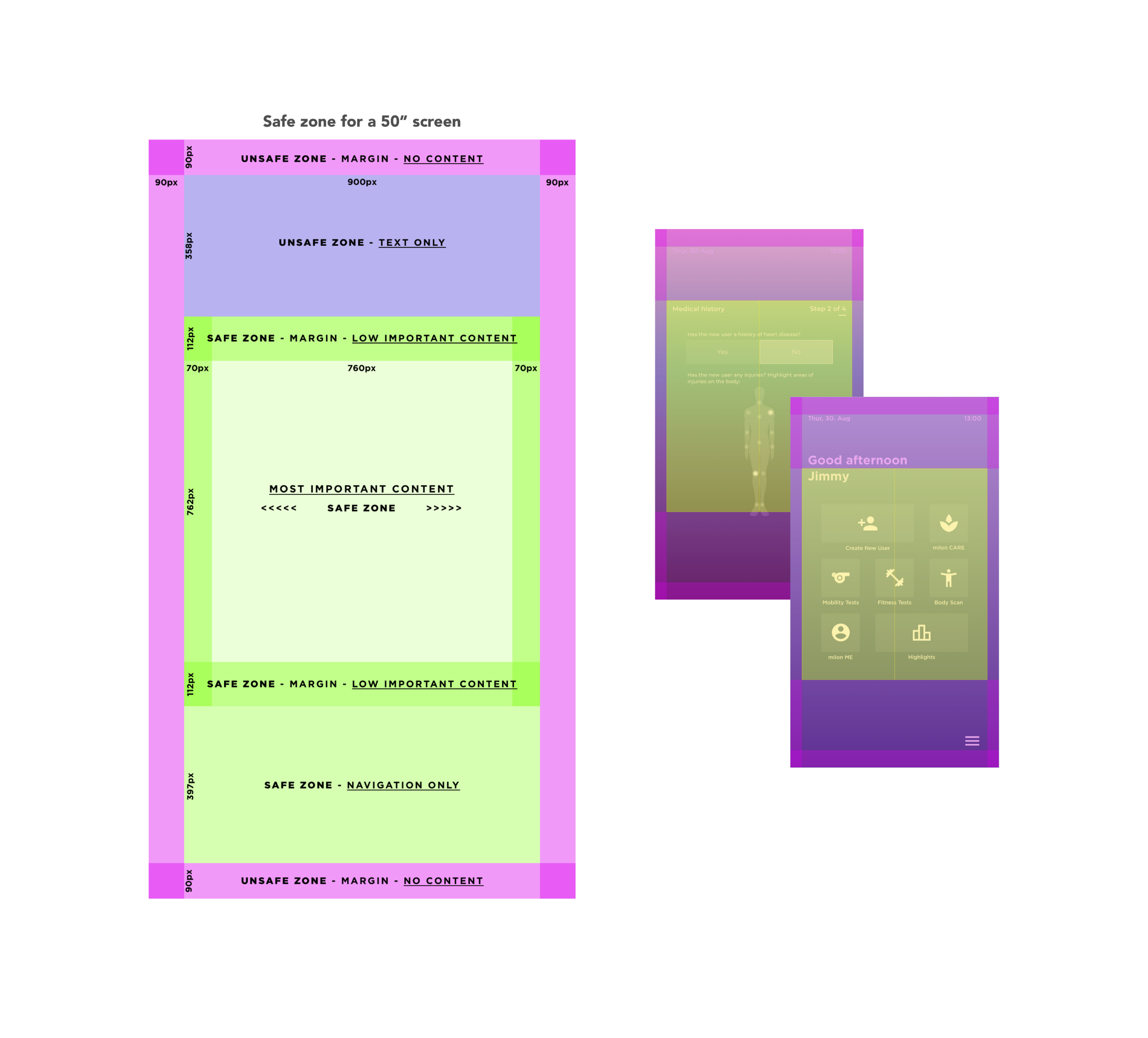
The display would be a 50” 4K touchscreen monitor flipped vertically
The eye-tracking will be very different compared with smaller displays normally displayed horizontally
Gender representation of each user must be considered carefully
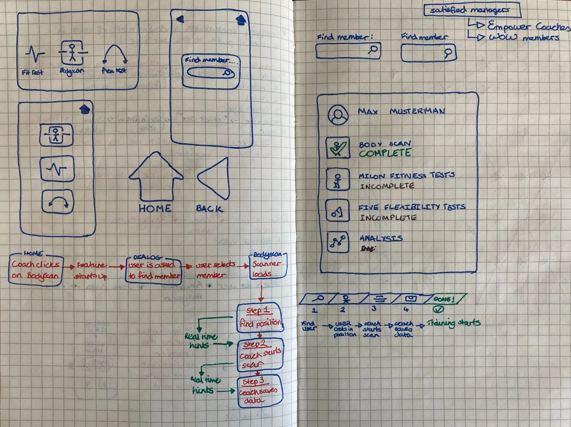
Mapping the user flow
A collaboration task with the senior software architect.
Prototype
I digitised wireframes in preparation for usability testing. I prepared designs with varying fonts, colours and simple animations to allow users to evaluate their experience on a big screen. This process took a lot of collaboration with the hardware team as we were evaluating the physical user experience as much as the digital experience.
I created different grids based on studies by Samsung and Apple for best practices in designing TV apps. I placed buttons and text on the various grids and then exported them as PNG’s to be displayed on the hardware prototype’s 50” 4k monitor.
Key learnings
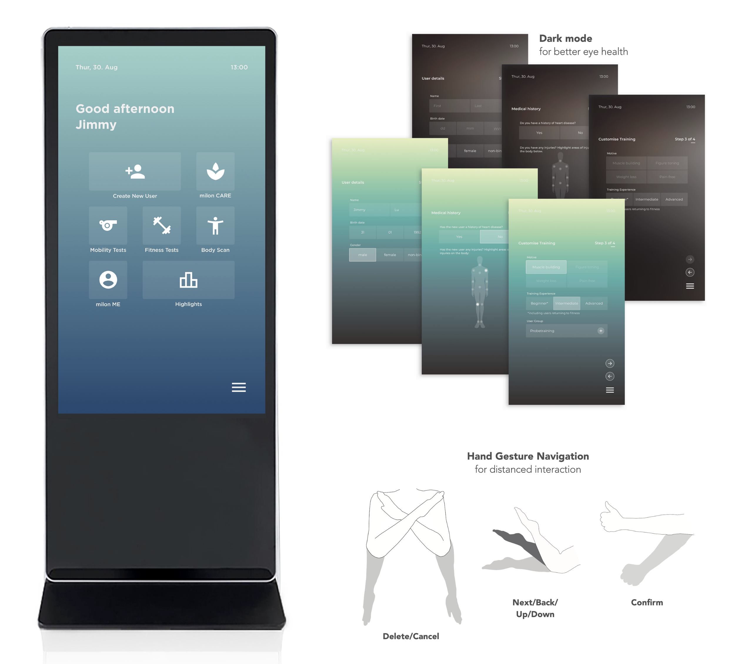
Large text is perfect for hand gesture navigation from a distance, but users strain their neck trying to read it if they are using it up close.
The bright light of the monitor is not healthy for up close use
Smaller users struggle to reach buttons in the upper half of the display
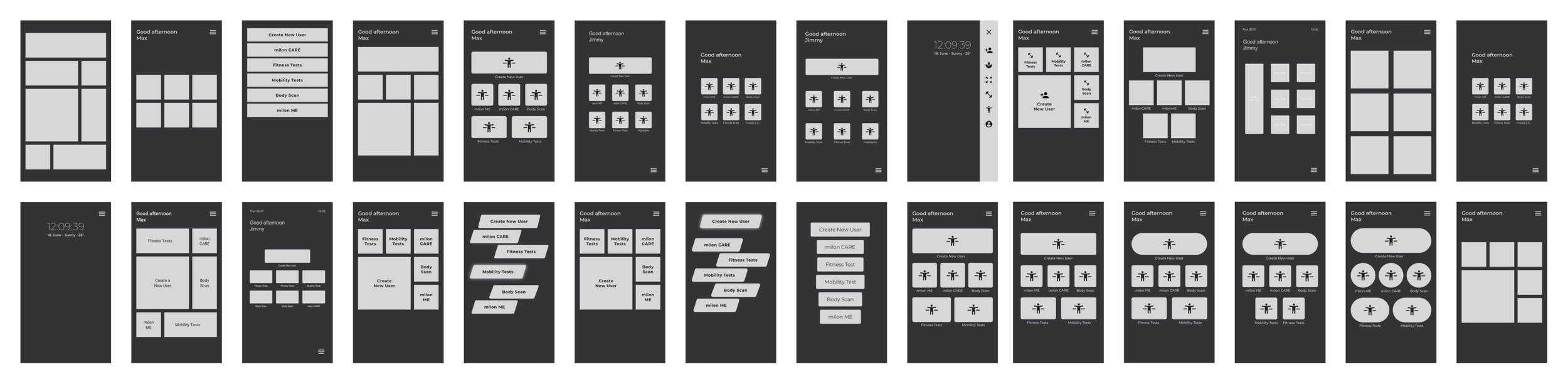
First iteration based on prototype testing
Test
As a team, we tested throughout the development process because our product was brand new and did not exist on the market.
Due to covid regulations, we could only test internally.
I then gathered a group of volunteers to interact with the wireframes and fill out a survey afterwards. I observed their behaviour and asked them questions throughout. It was important they evaluated each wireframe up close and from a distance as the final product would also use image mapping technology to respond to hand gestures.
I analysed the results of the prototype testing alongside the product manager and a hardware engineer. We grouped results into patterns and formalised our recommendations moving forward. We then played back our findings in a Stakeholder sync.
Physical vs digital experience
there is an ideal safe zone for displaying elements
the screen should be angled to prevent wrist strain
the height from the ground should be adjustable to
accommodate various heights of users, including users with disabilities.
Final words
What went well.
The software architect, product manager and I worked in close collaboration with weekly pairing sessions to define and solve issues together.
What blockers I faced.
Covid-19 was one of the greatest blockers to our research. In the past, we did usability tests in person to gain accurate observable insights of our users’ experiences.
How I dealt with problems.
Since we couldn’t get external users due to Covid-19 restrictions at the time, I set up a dogfooding pool of internal volunteers from the company and coordinated their tests in a safe environment.
What I would have done differently.
I would have liked to use a more scientific method to measure perception on the 50” display. Eye-tracking or heatmaps would give a greater understanding of the users’ visual interpretation of the content in combination with the qualitative survey results and behavioural observations.
milon Industries GmbH
For more than 50 years milon have been concerned with how people can train as simply, safely and effectively as possible. The result is a series of unique training systems, accompanying system solutions and comprehensive operator concepts.
milon Industries is based in the small town of Emersacker, Bavaria. Everything they create is proudly made in Germany by an ISO-certified workforce.